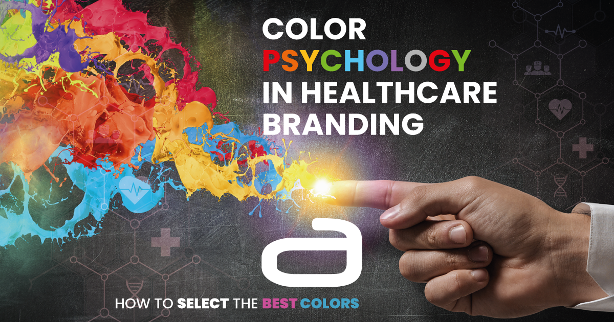
When it comes to marketing, first impressions matter! It only takes 50 milliseconds for users to form an opinion about your brand. [i] And while many factors influence these impulse impressions, color is a key differentiator. Learn how Color Psychology in Healthcare branding can help you grow.
Maintaining strategic and purposeful branding colors can help your B2B healthcare company engage users, increase brand recognition, and communicate your message effectively. However, choosing the right branding colors requires understanding the concept of color psychology and applying its theory to your unique audience, their needs, and values.
Why Brand Colors Matter—Color Psychology
Whether or not you have actively thought about or noticed it before, colors elicit certain reactions, which are the foundation of color psychology. HubSpot defines color psychology as “an area of research that looks at how color influences our behavior and decision-making. When used in marketing, for example, different colors can impact the way buyers perceive a brand in ways that are not always apparent, such as how certain hues can increase appetite.” [ii]
Download the latest infographic Color Psychology in Healthcare Branding
This graphic sheds some light on why so many healthcare brands use blue as their primary branding color. People perceive blue as dependable, calming, and trustworthy, which are the values that consumers seek when interacting with the medical field. However, this does not necessarily mean that you must or even should automatically use blue for your B2B healthcare company’s branding.
Using a signature color can increase brand recognition significantly [iv], therefore may be merit in using a color that helps you stand out from your competitors. Likewise, using a combination of high contrast colors might make your visuals and messaging more eye-catching. But, ultimately, the colors you choose for your healthcare brand should depend upon one thing above all else: your target audience.
How To Pick Your Healthcare Brand Colors
To best choose the most effective branding colors for your B2B healthcare company, you need to start by asking the following questions:
- Who is your audience?
It will be impossible to pinpoint what brand colors will work best if you do not have a solid understanding of your target audience. For B2B healthcare companies, you need to carefully consider whom you are talking to and what they are looking for when they come across your brand or website. Narrowing in on your target audience’s age, gender, interests, problems, and values can help you better determine which colors will resonate with them and why.
- How do you want to make them feel?
Once you understand your target audience, you should consider how you want your brand color to make them feel. Excited? Assured? Protected? Curious? Color is another opportunity to connect with your audience and convince them that you offer the best solutions to their needs.
- How do you want them to view your brand?
A mismatched message can be confusing and sabotage your brand’s success. Imagine if your luxury brand looks like a budget deal, or your innovative ideas hide behind adequated visual cues.
How To Pick Your Healthcare Brand Colors
Using color psychology for your B2B healthcare branding can help you clearly and effectively communicate your value, goals, and mission. Correct color selection can create a memorable representation of your brand and a lasting impression of your offerings. Color is a fast and effective tool that, when used purposefully, can promote brand awareness and growth.
Are you leveraging the power of color? If you are branding or rebranding your healthcare company, we can help. Let’s discuss how implementing powerful visuals can accelerate your brand’s growth.
References AND RESOURCES
- CXL. (2019). First Impressions Matter: Why Great Visual Design Is Essential. [online] Available at: https://cxl.com/blog/first-impressions-matter-the-importance-of-great-visual-design/#:~:text=It%20takes%20about%2050%20milliseconds [Accessed 22 Feb. 2022].
- Kolowich, L. (2017). Color Psychology in Marketing [Infographic]. [online] Hubspot.com. Available at https://blog.hubspot.com/marketing/psychology-of-color.
- The Logo Company. (2020). The Psychology Of Color In Logo Design. [online] Available at: https://thelogocompany.net/psychology-of-color-in-logo-design/.
- www.rebootonline.com. (n.d.). What is the Importance of Colour in Brand Recognition? | Reboot. [online] Available at: https://www.rebootonline.com/blog/what-importance-colour-brand-recognition/.